## Compute and plot a PCA using geomorph:
pca <- geomorph::gm.prcomp(
  A = gpa$coords,
  scale = FALSE
)
plot(pca)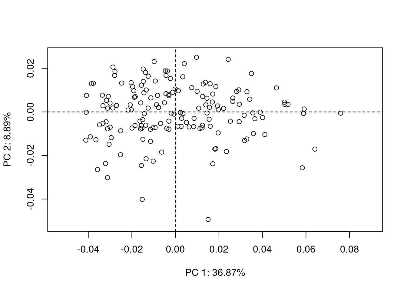
{geomorph}.
![]()
Samuel Bédécarrats 
Floriane Rémy
Frédéric Santos
Once the landmark coordinates are aligned using procrustes superimposition, the next step is usually to perform a principal component analysis on procrustes coordinates. We suppose here that you are already roughly familiar with PCA. If not, there are many excellent references out there on this topic (Escofier and Pagès 2016; Jolliffe 2002; Saporta 2011).
In R, if the Procrustes analysis was previously done using the package {geomorph}, performing a PCA on Procrustes coordinates is straightforward:
## Compute and plot a PCA using geomorph:
pca <- geomorph::gm.prcomp(
A = gpa$coords,
scale = FALSE
)
plot(pca){geomorph}.
The PCA plots produced using {geomorph} are moderately appealing, but have an interesting feature: they allow you to select one point on the plot and visualize interactively the corresponding shape. This is the role of the function picknplot.shape(), that you can try using the following code:
## Picking a point on the PCA plot:
picknplot.shape(plot(pca))
Note that you can save as PNG files the shapes that you pick on the plot.
However, if you don’t need the interactive function, you might want more fancy plots, or simply want to get rid of {geomorph} for subsequent statistical analyses. For that, a first step would be to convert your 3D-array \(A = (a_{ijk})\) into a 2D-dataframe, with one row per individual, and all landmarks coordinates in columns. This can be done easily with:
## Reshape the array as a dataframe:
dtf <- two.d.array(gpa$coord)
dim(dtf)
[1] 159 206Let’s visualize the first rows and columns of this dataframe:
## Display the first 5 individuals, and the first 3 landmarks:
print(dtf[1:5, 1:6])
1.X 1.Y 2.X 2.Y 3.X 3.Y
M-180 -0.1417625 0.03492547 -0.1030533 0.01267702 -0.07466851 0.02736972
M-181 -0.1476114 0.03581321 -0.1008090 0.01099173 -0.07646409 0.02780959
M-182 -0.1453364 0.03634743 -0.1057778 0.01245178 -0.07313214 0.02769433
M-183 -0.1457895 0.03535676 -0.1082345 0.01109507 -0.07503306 0.02708066
M-184 -0.1471057 0.03722540 -0.1051101 0.01152485 -0.07205863 0.02788060The principal component analysis can now be performed on this dataframe, using more appealing functions, here coming from the R package {FactoMineR}:
## An alternative PCA plot with FactoMineR:
pca.facto <- FactoMineR::PCA(
  X = dtf,
  scale.unit = FALSE,
  graph = FALSE
)
plot(pca.facto, label = "none")
{FactoMineR}.
Strong outliers (i.e., individuals with landmarks configurations that are very different from what is usually observed in the rest of the sample) can be spotted on the PCA plot. However, there are several drawbacks in this simple approach:
Thus, we can identify outliers by applying Tukey’s rule2 (Tukey 1977) on the univariate series of procrustes distances from each individual to the mean shape. (Note that this is a way of turning a multivariate problem into an univariate problem.)
plotOutliers(gpa$coords)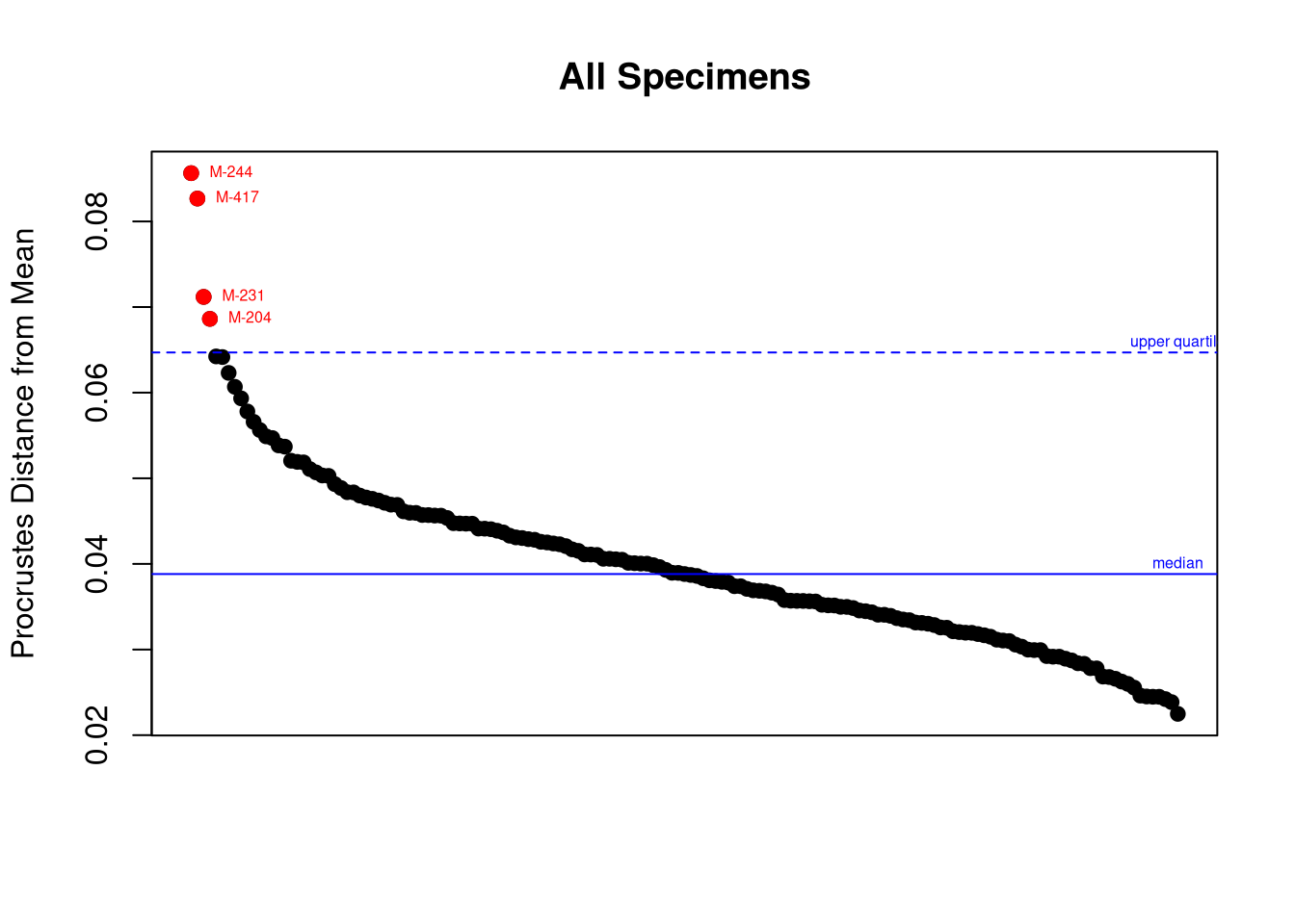
Once these individuals are identified, we should go back to their specific model and landmark coordinates to see where was the mistake (if any). This is the role of the argument inspect.outliers = TRUE below:
plotOutliers(gpa$coords , inspect.outliers = TRUE)Interpreting PCA plots like Figure 4.2 is very difficult if you don’t know the meaning of each principal axis. The best way for that consists in visualizing the extreme shapes corresponding to the left and right bounds of each axis. This requires to predict the shape at these precise locations.
## Mean shape:
M <- mshape(gpa$coords)
## Predict extreme shapes along PC1:
PC <- pca$x[, 1]
preds <- shape.predictor(
    gpa$coords,
    x = PC,
    Intercept = FALSE,
    pred1 = min(PC),
    pred2 = max(PC)
) # PC 1 extremes
## Plot extreme shapes:
par(mfrow = c(1, 2))
plotRefToTarget(M, preds$pred1)
mtext("PC1 - Min.")
plotRefToTarget(M, preds$pred2)
mtext("PC1 - Max.")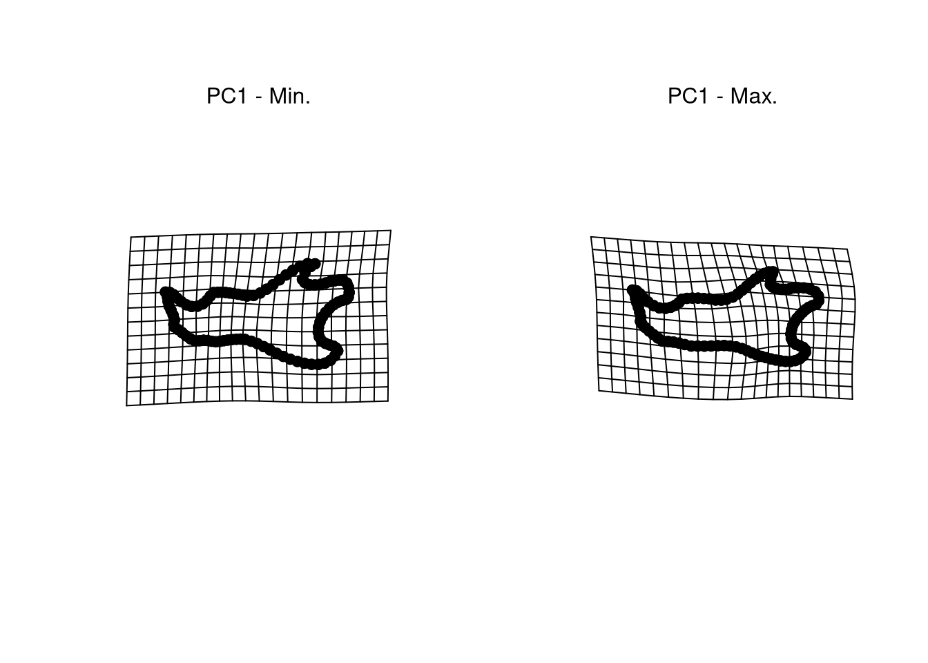
This is not a trivial question at all. Many methods do exists to identify univariate and multivariate outliers (Santos 2020), but there is still some degree of subjectivity in deciding what exactly an outlier is.↩︎
This is the most common rule for defining univariate outliers, and the rule used to display outliers on boxplots by all statistical software. See also help(boxplot.stats) in R for more details.↩︎